Showing posts with label before and after. Show all posts

Friday, November 7, 2008

Room makeover, a before & after: Making the inside as lovely as the outside

A client recently called me with a challenge: She was tired of the layout of her family room/dining room, which had essentially been the same for 20 years.

The challenge: The room was already quite nice, with beautiful furniture and a fine layout. Its water view along an entire wall didn't hurt either.

But I did see a few ways to improve the room. Notice how boxy and square the furniture arrangements were, both in the living area and the dining area in the "before" photo? I put the dining table at an angle to add some interest.

And I place the sofas opposite one another. This not only adds furniture on the water side (the room was a bit furniture heavy on the non-water side before), but now you get a direct view of the fireplace as you walk in the room.

Overall, the arrangement really opens up the room, giving you an expansive feeling, similar to what you get when you look out the windows at all that water.

The room also felt too brown before. I borrowed red accents and accessories from other rooms to add splashes of color.

Finally, I created a third use for the large room. The table that used to be behind the sofa is now in a corner, where it can serve as a desk or a spot to play a game...or stare at that view...

Stumble Upon Toolbar

Thursday, October 23, 2008

Room makeover, a before & after: Creating a cozy living room

A client of mine recently moved into a home that the family had previously used only for vacations. She needed to incorporate some pieces from both homes and start to think of this house in terms of year-round use.

I thought the living room redesign was a good way to illustrate a few decorating tips. In the before photo above, you can see that the furniture was essentially pushed up against the walls.

In the makeover, I positioned the furniture in the center of the room, creating a cozy sitting area with the fireplace as the focus. There's still plenty of room behind that sofa to make your way to another part of the house.

If your furniture is up against the walls at your house, try moving some pieces into the middle. You may be surprised at how that transforms the room. Just leave yourself obvious paths through the room and into other spaces.

This room was also helped by the addition of lamps. Even if there are lots of overhead lights or sconces, nothing warms up a room like lamps. And, we used small wicker boxes that the home owner's daughter was storing toys in as end tables.

It's always a good idea to have somewhere to place a cup of coffee or a glass of wine while you sit and admire your new room.

Stumble Upon Toolbar

Tuesday, September 16, 2008

Room makeover, a before & after: Great stuff in this great room

I wanted to share with you one of my favorite things about a recent great room re-design that I did.

This couple has a beautiful home in a terrific setting, with a horse, sheep, a goose, a chicken (not a rooster... which is what I originally called it... cause I'm not exactly a country girl...) cats and dogs.

They love nature as you can readily tell when you look around their home.

But a lot of the items they have collected are little, and they were lost in this big room. Do you see the eggs on the mantel in the before photo? They were up much too high to be appreciated.

So, I took a cabinet that was filled with glassware and situated near the dining table and instead moved it into the living area. I took all the little artifacts from around the room and displayed them there instead.

It's kind of like a miniature museum of natural history. Now you can really appreciate each item.


For the rest of the room, I focused on using large objects that wouldn't get lost... such as the mirror and plants on the mantel and the birdhouse on the console table.

Here are a few more before and after photos I thought you might like to see...

Stumble Upon Toolbar

Wednesday, September 3, 2008

Room makeover, a before & after: Creating a bedroom retreat

The Day of New London, Conn,'s Spaces magazine today featured a story about how I re-design a room by using furniture, artwork and accessories that a homeowner already owns. The magazine used this bedroom that I re-designed as an example and I thought I'd post a few of the photos that I took because I think they illustrate solutions for some pretty typical problems.
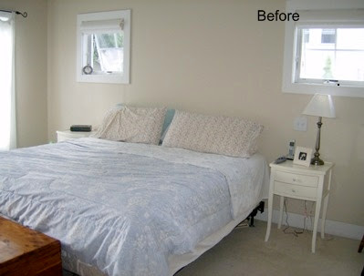
In the "before," it's clear there wasn't much color in the room. It looks like the homeowners just moved in, doesn't it? In fact, the very nice couple who owns this home had been there for quite some time.

A few other problems: There's no headboard, so the bed wasn't featured as well as it could have been. And the bed isn't facing the entrance to the bedroom, which is usually the best spot for making a bed the room's focal point.

In the "after," you can see that I infused color by swiping pillows, plants, frames and vases from here and there around the house. And, most importantly, the print over the bed - which you couldn't really see so well in the hallway where it previously had been - adds a lot of interest over the bed and acts as a headboard substitute of sorts.

I grabbed some daylillies from the garden, too. How nice of them to be growing just as I needed a shot of orange!

In this before, you see the TV on a white table. In a perfect world, it's better to leave the TV out of the bedroom if you're trying to create a bit of a retreat. But in the real world...

...it's better to at least downplay the TV as much as possible. It disappears better on top of the dark dresser versus on top of the white table. (I managed to get more color in this part of the room by using some of the kids' art.)

Finally, I found the wicker rocker in a storage room and freshened it up with a few pillows that where elsewhere in the house (and I really don't think they will be missed) to create a little sitting area. A great way to make a bedroom more relaxing is to add a chair where you can read....or sit and admire your new room...

See the orange print above the white table (that previously held the TV)? You can't see it from these photos, but there are actually four of them in the room. The homeowner had all of them in storage.

I can't tell you how often that happens... People think they need to buy more stuff to make a room attractive when all they really need to do is to shop around their own homes.

Stumble Upon Toolbar

Thursday, July 31, 2008

Real Estate Staging: Fireplace for sale; comes with house

Here's the thing about fireplaces when you're trying to sell your house. If you've got one, you've got to get it to jump up and down and scream: "I'm here!"

Cause everyone, and I mean everyone, loves a fireplace.

Here are a few tricks that I used to get a fireplace hopping at a home I staged for sale.

Notice how in the before photo, the print on the mantel blends in with the paint... but the darker star jumps out. The green plant in the corner draws your eye to that part of the room as well.

But, perhaps most importantly: the chaise portion of this sectional sofa, which stuck out in front of the fireplace is gone. (It's a little tougher to see in the top two photos, but look at the photo below and imagine the chaise jutting out in front of the fireplace.)

I moved the chaise to the master bedroom, where it helped create a luxurious feel in there. And the family room now looks bigger and you've got a clear view to that fireplace.... that fireplace that's going to help sell that house...

P.S.: Remember to enter my contest for a fun art project by leaving a comment on Saturday's post!

Stumble Upon Toolbar

Wednesday, July 30, 2008

Real Estate Staging: Making room for family

Sounds like a few of you are planning to put your houses on the market soon, given the responses to a before-and-after of a real estate staging that I posted earlier this week.

So I thought I'd offer up another example. This time it's a family room in a house that I staged.

You can see in the before shot of one side of this family room, there were too many knickknacks displayed for a house that is for sale and there really was no focus.

In the after, the knickknacks are largely gone and the sofa takes center stage. The pillows add some visual warmth and the furniture arrangement really illustrates how this room is great for family time.

On the other side of the room, a bar was the focal point, basically breaking two rules for house staging: Put away your collections and don't feature alcohol.

Alcohol-related items, along with family photos and religious items, fall into the category of the personal and are better off packed away while your house is on the market.

Besides, this end of the room looks better with the table and chairs. It's a perfect place to sit to play a game of chess... or to write up an offer.

P.S.: Remember to enter my contest for a fun art project by leaving a comment on Saturday's post!

Stumble Upon Toolbar

Monday, July 28, 2008

Real Estate Staging: Keep the kids; sell the house

Before you know it, summer will be over, kids will be back in school (where did that confetti come from? Did you throw that?) and the real estate market will start to wake up.

As a professional real estate stager, one question I get a lot is: How important is it to stage (rearrange furniture, accessories etc. to make a room more attractive to a buyer) children's bedrooms?

Here's my take on that. They are not the most important rooms in the house when it comes to staging, but there are some simple things you can do to make a good impression with buyers.

Put away (or get rid of) as many toys, clothes and kid stuff as possible. That way you give potential homebuyers an idea of how large the room is, what sort of shape the floor and walls are in, and how much closet space there is.

It's also a good idea to arrange the room to show off its best features.

Check out these two examples of children's rooms that I staged:

In this case, I placed the bed kitty corner. That takes up a bit more room, but it highlights the two windows. Who knows what the new homeowner will use the room for? Could be an office; could be a guest room. But hopefully the potential buyers will remember the nice windows when mulling over the house.

I also removed some of the furniture, leaving only what was absolutely necessary while the home was on the market.

I did much the same thing in the next child's room. Aren't you more drawn to the windows in the after photo?

And I recommended the homeowner stash the giant gorilla that is under the windows in the before photo... You want potential buyers to remember a bright and airy room...not a giant primate, you know, when you can help it.

P.S.: Remember to enter my contest for a fun art project by leaving a comment on Saturday's post!

Stumble Upon Toolbar

Friday, July 25, 2008

Room makeover, a before & after: Taking back a spare room

Do you have one of these rooms in your house? Nearly everyone does. It's a guest room/storage room/retired furniture room/good place to hide to eat the last piece of birthday cake room.

I thought I'd show you a re-design of a room like that in a client's house. The homeowner used this room as a guest room for her mom. But there was also a wine cooler in there and a mish-mash of furniture that didn't quite fit anywhere else. (The fourth wall you don't see is a wall of closet doors.)

The homeowner wanted her mother to feel more comfortable when she stayed. So, we moved the wine cooler into the closet, and the wicker settee into another space to create a reading nook.

I moved the daybed to make it the focal point of the room and used the homeowner's blue and white bedding for a fresh look.


I grabbed a bookcase, coffee table and accessories from elsewhere in the house. (Take a little bit from here, a little from there and you really don't harm the look of the other rooms.)

I even brought in a patio chair. It's a placeholder until the homeowner gets a more comfy chair for the room, but it serves the purpose for now.

The blue and white in the accessories help pull the room together and the lamps make the room cozy.

Who wouldn't want to stay here... especially now that you know there's wine in the closet?

Stumble Upon Toolbar

Thursday, July 24, 2008

Room makeover, a before & after: Saying "welcome home"

What's the first thing people see when they enter your home? I mean, on a good day... when the shoes are away, the jackets stored, the iguanas back in their cages, the engine parts stashed...?

I thought I'd show you this mini-makeover that I did as part of a client's living room re-do to illustrate how to brighten your entryway... even if it isn't very large.

In this home, the wall to the right of the staircase and opposite the front door was a perfect place to define as a welcoming spot. In the before, however, the table is a too small, and is turned toward the living room... trying to be a part of it, but not quite making it.

And the candle, vase and other little accessories don't make a bold statement.

To create a more dramatic landing spot, I used a larger piece of furniture, facing it toward the front door, and a bigger picture and vase with flowers, all of which the homeowner owned.

And I always like a tray, or a long, shallow dish like I used here, near the front door. It's a good place to put your keys, sunglasses etc. when you come home. (Added bonus: You'll always know where they are!)

Finally a lamp brightens the area and catches your attention, making you pause before you enter the rest of the house.

And think of all the stuff you can hide in those drawers...

(If you're looking for lots of great ideas, check out Rocks in My Dryer's Works-for-me Wednesday feature... even though it's not Wednesday...)

Stumble Upon Toolbar

Friday, July 18, 2008

Room makeover, a before & after: I could really use a back rub, too...please

I mentioned last week that I finally got around to putting my deck together for the summer... good thing, since pretty soon I'd have to skip the whole thing and hang the Christmas lights out there instead.


I wrote that I rearranged the furniture, much like you would do in an interior room, creating a focal point (the bench) and giving the room some definition (with the potted trees).


This week I finally put out the soft things: the pillows, tablecloth and flowers, the stuff that beckons you to come on out and take a seat....


...but first, would you mind grabbing me a cocktail...maybe a little bowl of chips...my slippers...ooh, a magazine...heck, my pajamas...?

Stumble Upon Toolbar

Thursday, July 17, 2008

Room makeover, a before & after: Maybe I just want to hide...

I seem to have this thing about tents, like maybe I'm really supposed to run off and join the circus.

Case in point: Check out these two room re-designs that I did for a client. In both cases, I used curtain panels to create little fortresses in the girls' rooms.

Here, using a canopy frame that the family already had: Before:

and After:

And here hanging the curtain panels from the bump-out in the ceiling (I've explained this one in more detail in the past.)

Here's the before:

And the after (although if that wasn't obvious, perhaps I really do need to consider circus work for my next career...):

But, what to do in a boy's room? Good question.

Here's what I did for my son. I used two twin bed sheets and clipped them to a rope (do this only after your kid is past the pulling on the rope relentlessly until it comes out of the wall, and then hurting himself with it stage...) . I screwed heavy-duty closed hooks into the wall and tied the rope to them.

It's a fort when the drapes are closed, stage curtains when they are open. Pass the peanuts, please.

Stumble Upon Toolbar

Tuesday, July 15, 2008

Room makeover, a before & after: Better than winning the lottery

Looking for a little more excitement in your life? Would you settle for some in your family room?

This redesign I recently completed for a client illustrates a few ways you can brighten things up.

First: I loosened up the furniture arrangement. There was not much space between the sofa that faces the fireplace and the wall behind it. Now the room has a much airier feel.

Second: I added lamps to the end tables. Even if there is plenty of overhead lighting, lamps will add a warmer, cozier feel to a room. They also add much-needed height to the tables.

Third, and perhaps most importantly: I sprinkled in pillows and accessories, adding the color blue. The rug has some blue in it, as does a print above the chair shown at left. Spreading that color around the room brings zing to an otherwise neutral color scheme.

1, 2, 3. Now that's exciting.

Stumble Upon Toolbar

Tuesday, July 8, 2008

Room makeover, a before & after: Now everyone's going to want an invite

I thought I'd fill you in on a redesign I've been working on for a family in Massachusetts. Their home is beautiful; it just needed to a little punch and a little more color. I employed few design strategies that I thought I'd pass along.

The kitchen table was originally surrounded by four chairs. I pulled in a bench that was in the mudroom and was really too large for that space anyway. This not only provides two more seats at the table, it makes the dining area more interesting.

Next, I added a cushion to the bench to warm it up. The foam was cut to size, something most fabric stores will do for you. I covered it in a cheery blue, green and yellow stripe. The fabric is outdoor fabric, meaning it should stand up a bit better to the two children in the family. I also added a pillow with flowers in the same colors.

The original table centerpiece was too small. So, I found a cutting board with feet that the homeowner already had and grouped items that are used at the table anyway: salt and pepper shakers, napkins, oil and vinegar holders.

The lemon tree was lost as an accessory elsewhere in the kitchen. But on the cutting board, it provides a nice bit of color.

With a bit of contrast (the iron of the bench vs. the wood of the chairs), a little softness (from the cushion and pillow) and some drama (the height of the cutting board and the grouped accessories), the space is much more inviting.

Later this week, I'll show you a few other spaces in the home...if you behave.

Stumble Upon Toolbar

Tuesday, June 17, 2008

Ta-da: The office makeover

As promised, I'm posting photos from an office makeover that my friend Marianne and I did recently. A nonprofit organization won the makeover as part of a larger prize.

The space posed a few challenges for me and Marianne (who owns Consignments Ltd.): The office is in an old mill building, and is large (probably 600 square feet). The organization, Options, puts out a newsmagazine, so it needs tables for preparing it for distribution once a month.

It also uses some bulky items, like bins and carts, but had no storage space. Options would also like to hold meetings at the space, and there really was no comfortable spot for hanging out.

Marianne and I did the makeover in about a day. This would not have been possible if Marianne wasn't such a workhorse. (Only not a horse like this: ; more like this: .)

Chances are you don't have a space quite like this, but there are some ideas you can steal:

We bought some office dividers at a business surplus store and put them together to create both a storage room and a wall that would act as an entrance to the large space. The Options sign hangs on one end of the new storage space. (In the Rhode Island area, this is a good place to find business surplus items at very reasonable prices: the aptly named Business Surplus Inc. Rhode Island.)

Along with the bins and carts, we stored a few of the tables and some chairs in the storage area. The tables and chairs can come out once a month, but in the meantime there's room for the lounge we created with sofas from Marianne's store. We added a rug, and few pillows and accessories, and it's a comfy meeting spot. (Check out the little tables I painted, too.)
We used a print they already owned in the bathroom (tip: a big piece of art in a small space makes a really big impact) and the mirror I also painted orange. (I like taking a traditional item like the Chippendale mirror and paining it a bright color to create a funky look.)

Paint is a great tool to use when you've got a lot of space to decorate.

Options already had 25 of the first pages of its newsmagazines mounted on huge poster boards. But only six or so of them were up. They were painted in rainbow colors. So, we painted a bunch more and hung them up, too. Not only did the posters look colorful, but they helped unify the space.

We also hung some curtains (thanks to Marianne climbing a 15-foot ladder), switched out a bookcase for better organization, and a few little odds and ends and we were done.

Done, but too tired for even a glass of wine. And that's saying something.

Stumble Upon Toolbar