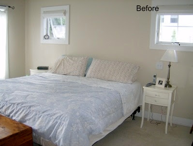
The Day of New London, Conn,'s Spaces magazine today featured a story about how I re-design a room by using furniture, artwork and accessories that a homeowner already owns. The magazine used this bedroom that I re-designed as an example and I thought I'd post a few of the photos that I took because I think they illustrate solutions for some pretty typical problems.
In the "before," it's clear there wasn't much color in the room. It looks like the homeowners just moved in, doesn't it? In fact, the very nice couple who owns this home had been there for quite some time. A few other problems: There's no headboard, so the bed wasn't featured as well as it could have been. And the bed isn't facing the entrance to the bedroom, which is usually the best spot for making a bed the room's focal point.In the "after," you can see that I infused color by swiping pillows, plants, frames and vases from here and there around the house. And, most importantly, the print over the bed - which you couldn't really see so well in the hallway where it previously had been - adds a lot of interest over the bed and acts as a headboard substitute of sorts.
I grabbed some daylillies from the garden, too. How nice of them to be growing just as I needed a shot of orange!
In this before, you see the TV on a white table. In a perfect world, it's better to leave the TV out of the bedroom if you're trying to create a bit of a retreat. But in the real world...
...it's better to at least downplay the TV as much as possible. It disappears better on top of the dark dresser versus on top of the white table. (I managed to get more color in this part of the room by using some of the kids' art.)

Finally, I found the wicker rocker in a storage room and freshened it up with a few pillows that where elsewhere in the house (and I really don't think they will be missed) to create a little sitting area. A great way to make a bedroom more relaxing is to add a chair where you can read....or sit and admire your new room...
See the orange print above the white table (that previously held the TV)? You can't see it from these photos, but there are actually four of them in the room. The homeowner had all of them in storage.
I can't tell you how often that happens... People think they need to buy more stuff to make a room attractive when all they really need to do is to shop around their own homes.


13 comments:
I also liked how you put the curtains on one side of the widows to frame out the bed. The room looks much improved!
I love this redesign! She had some great pieces to work with, and you did a great job reworking them. Can you come help me decorate my new home?? :) I have these great ideas of how I WANT my home to look, but I'm not sure how to get TO that point. :D
I think I'm addicted to your blog already!
That is a dramatic difference. I really love to study before and after pics!
Amazing what a difference little changes can make!!
Thank you for a peek into that re-design. It looks fabulous without changing their whole personalities!
The Texas Woman
Beautifully done!
That redesign is awesome! You're so talented!
That looks very nice! I just posted a redesign too that was a lot of fun to do. And we used everything they had too for the most part. I love those kind of redos!
The bed in front of the windows makes a huge difference. I like it a lot. Congrats on being featured!
Carrie
What a big improvement! Great job as usual!
What a great redesign! Your changes were a major improvement.
Great redesign! When we had our house built I really wanted two tall narrow windows in my bedroom but they said it was against the fire code so I had to settle with a large 4x6 instead. =o( I really like how you created the illusion of a headboard.
You know what? That is absolutely fabulous. Yep, you knew that! I love it. xo rachel
Post a Comment